Single page websites seem to be becoming popular among quite a few web developers. In my opinion, it is an effective way to show quite a bit of important information at a time, without becoming overwhelmed by navigation and embedded pages. To me, the single-page websites I browse work as brochures do in the print world. There is a balance that needs to be met when it comes to the content within a single-page website. Too much and the page becomes overwhelming and visitors can get bored if they’ve come for a specific purpose, no matter how fun and interactive the design, but too little and the website becomes pointless and the information within it probably would have been better composed in an e-mail or pamphlet.
The Weeknd: Abel Tesafay
A man in need of some serious help and rehab, but still I obsess over him. though I’ll try not to let my hopeless love get in the way of my critique. Abel, more commonly known as The Weeknd, is an alternative R&B singer who’s fame has escalated over the past couple of years.
As a frequent visitor of his website for no real reason, I’ve seen it change more times over the last few months than his entire singing career.
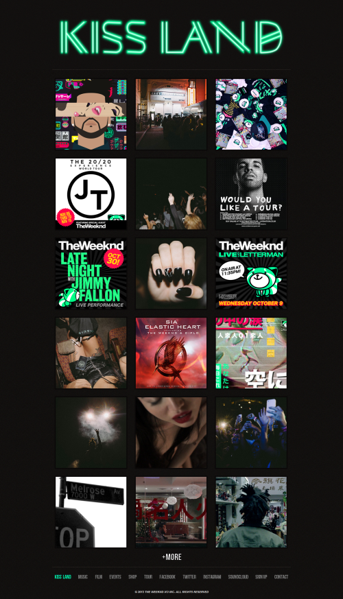
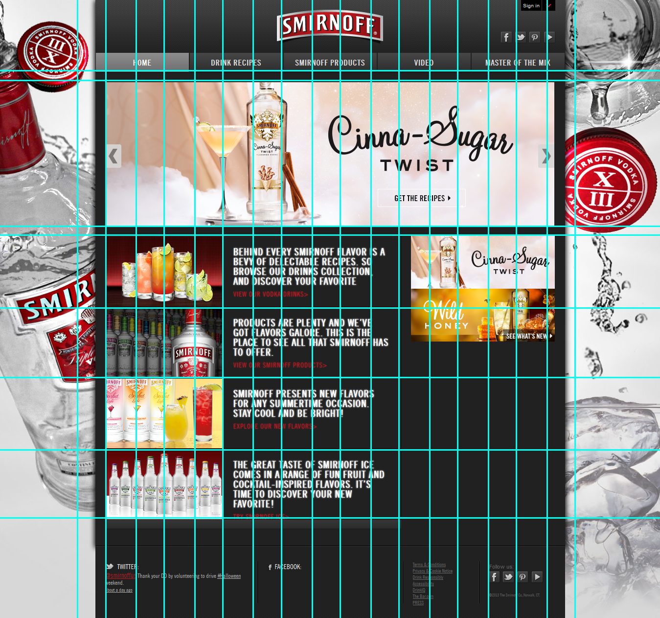
Abel Tesdaye’s homepage
A Rant on Navigation
In reality, Abel’s page is mighty useless. It’s even near impossible to find out when he’s on tour without doing some serious searching and trying to figure out if he’s even in the states and when is just as difficult. Each picture shown in the above screenshot when moused over reveals that it’s either a label to Events, Shop, Fans, Art, Music, or Film. Not many of them actually go anywhere. They actually pop up a picture, sometimes associated with the already provided pic, sometimes not. The pictures below reveals what happens when clicking on the shop or events displays.

The Weeknd Events Pop-Up

The Weeknd Shop Pop-Up
Film pops up a random video from his new album, music will send you to a page to buy his latest CD, there’s really no telling where you’ll end up when clicking on any of the photos. And to make it even “better,” there’s a ‘more’ button at the bottom as if you really want to get lost in more of the antics.
More Button
Now once you actually get to the navigation bar at the bottom of the page, if you decide not to go on a clicking spree looking for the prize inside the full cereal box, half the links lead to different websites and social media sites. Abel’s website isn’t that big, and not all too useful. It’s easier to google when and where he is than it is to find them on his site. The few links that stay on the website, Events and tours, only reveal the same posters from the homepage and you’re forced to click and expand them like above to view his schedule.
Visual and Color
The Weeknd’s site is themed after his newest album which actually just came out a couple months ago, hence his website change. Having been to his tour concert, I’ve become quite fond of the seafoam green and black that he’s begun to decorate everything with. Previously he had a chaotic Asian theme to match the album, but I can at least rest easy know that that’s gone…mostly.

Abel’s Asian inspired theme
In ConclusionThere already isn’t much to Abel’s website, but it’s at the same time rather chaotic, much like his life (maybe that’s the effect he was going for? Drug nostalgia…Doubt it). He really could benefit from a single-page website for organizational purposes alone. I don’t actually know why I visit the website so frequently, because I gain nothing from it; a few longful sighs as I gaze at glimpses of his face that I could just go to Instagram for. I didn’t even know I could buy the album from his site until the time I just spent exploring it. Some factors on his website, like the color theme, I get, others, like the insane navigation, I don’t. I think it needs to be calmed down, by a lot. Something that his visitors don’t need to be gone on XO to understand.

Abel’s imprint label, whether hugs and kisses, or his favorite drugs, maybe a little obvious.